By: Sergey So.
17 MAR 2017
1357
Custom controls and views can help developers improve the quality of the application while spending minimal time and effort.
Appus provides components that can be used in various solutions. All of them can be easily added to the project via cocoapods or as source files. This article is a CircularPickerView review.
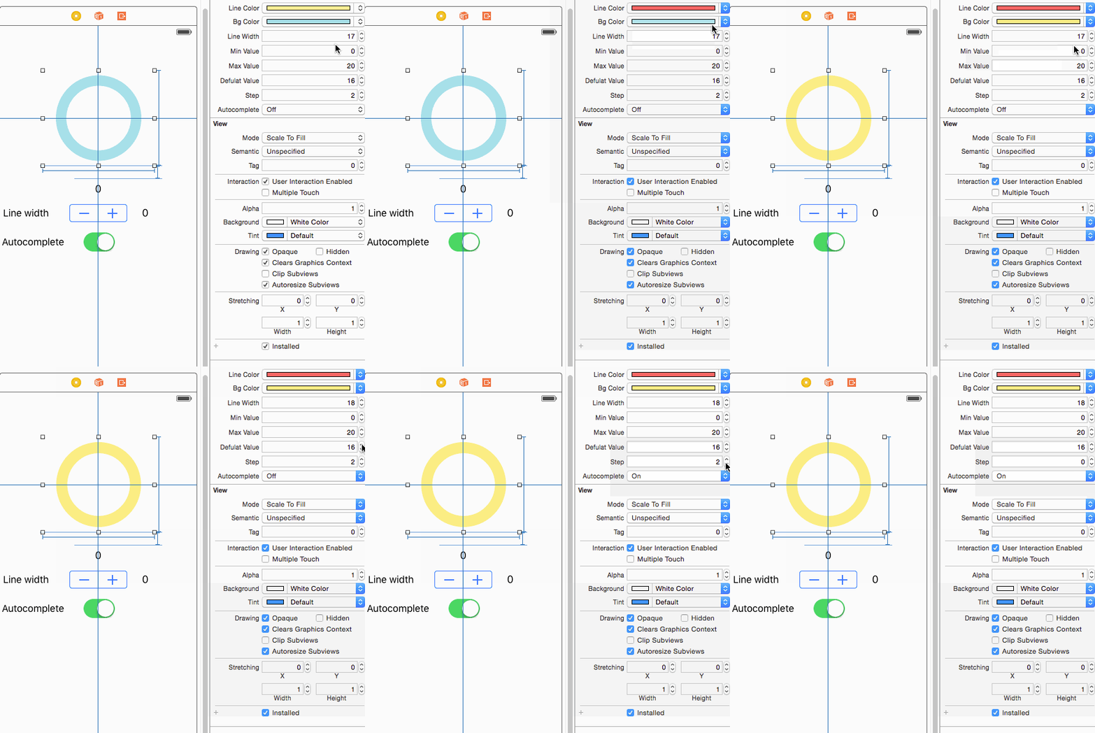
CircularPickerView is a very simple control. It allows users to select a values range and other basic properties of components, such as width, step, and colors. All of these properties can be easily customized from either code or storyboard.
The example of CircularPickerView config
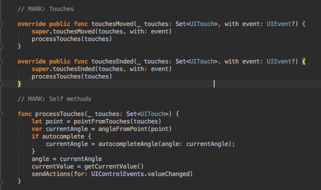
The component handles user interactions, touchesMoved and touchesEnded and events and sends basic control event valueChanged. The only thing you have to do is provide a handler for this event.
Process touches logic
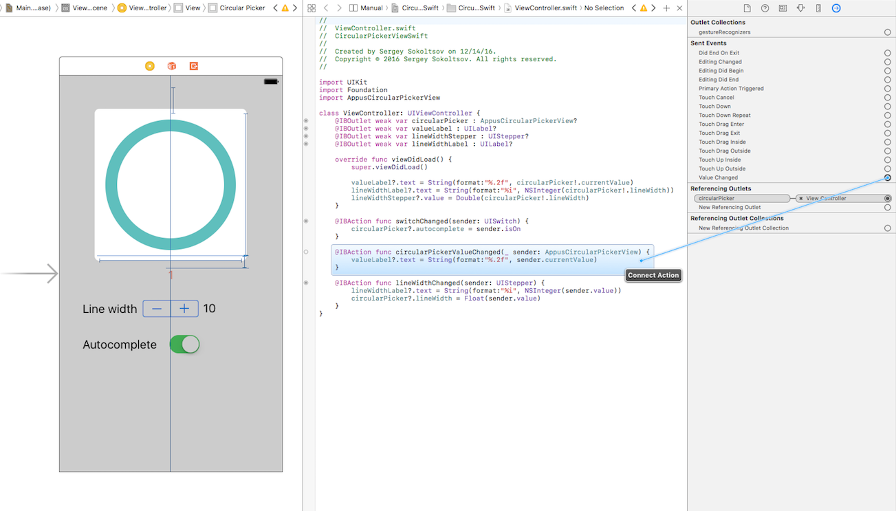
The example of connecting handler for valueChanged event
Inner logic is quite simple and is covered by basic geometry knowledge. It simply calculates the angle to the touch point and redraws two arcs and then uses background and active with the colors, width, radius, etc., which were previously set.
The inner logic of drawing
Explanations of the drawing logic:
-
The component defines the center point.
-
It calculates the maximum radius based on the line’s width and the view’s frame.
-
Set the start and end angles.
-
Draw the arc.
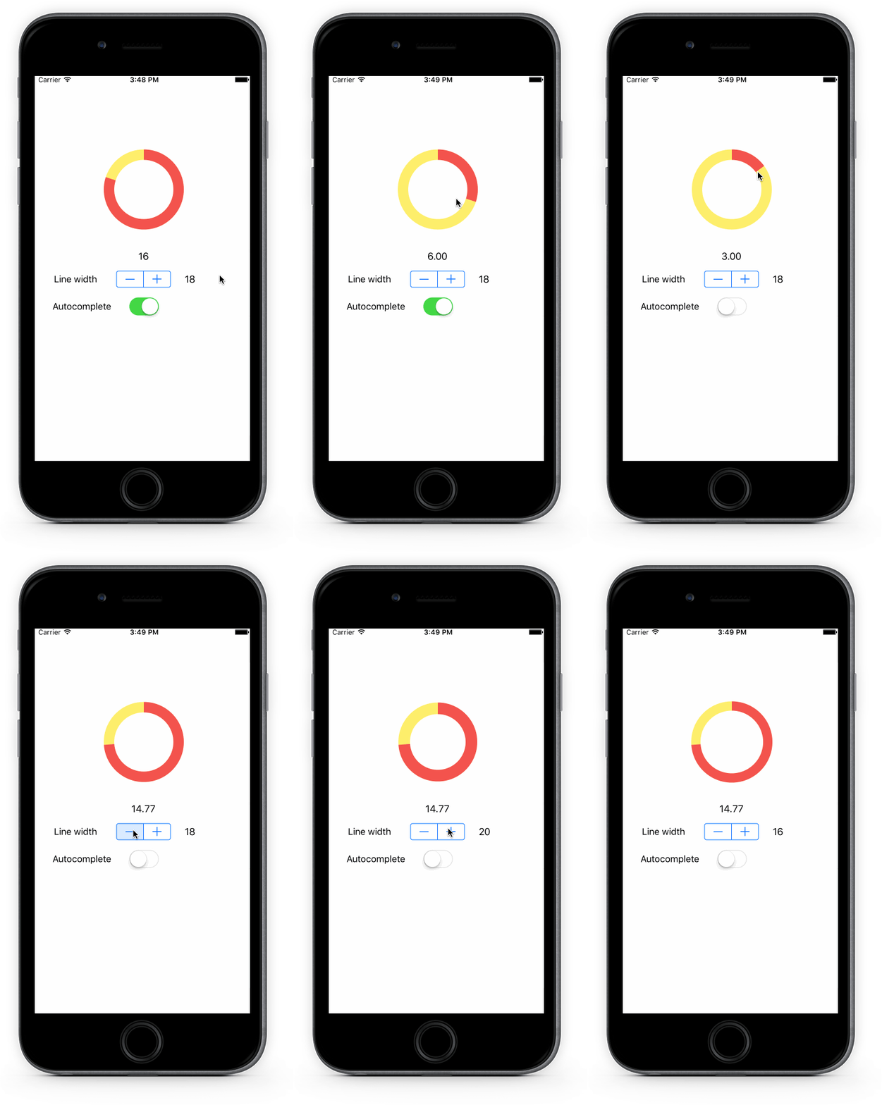
Here is some example of usage.
The example of CircularPickerView usage
Summary
We've implemented components which can be easily modified and used in your apps such as progressView or directly as a picker.
Visit GitHub to get the latest code of CircularPickerView.
 Services
 Work
Work
 Company
 Blog
Blog
 Contact
