By: Evgeniya Vi.
9 OCT 2019
2613
Mobile navigation helps to guide users, and a good navigation design allows users to get where they want while saving their time and nerves, thus making your product convenient and sought out, resulting in greater conversions to your product.
The small screen of mobile devices makes it difficult to debug perfect navigation, which is why there are various patterns that can solve this problem in different ways. Different navigation methods have certain pros and cons. Let’s look at the main ones, and then you can choose the most effective pattern for your mobile application.
Hamburger menu navigation pattern
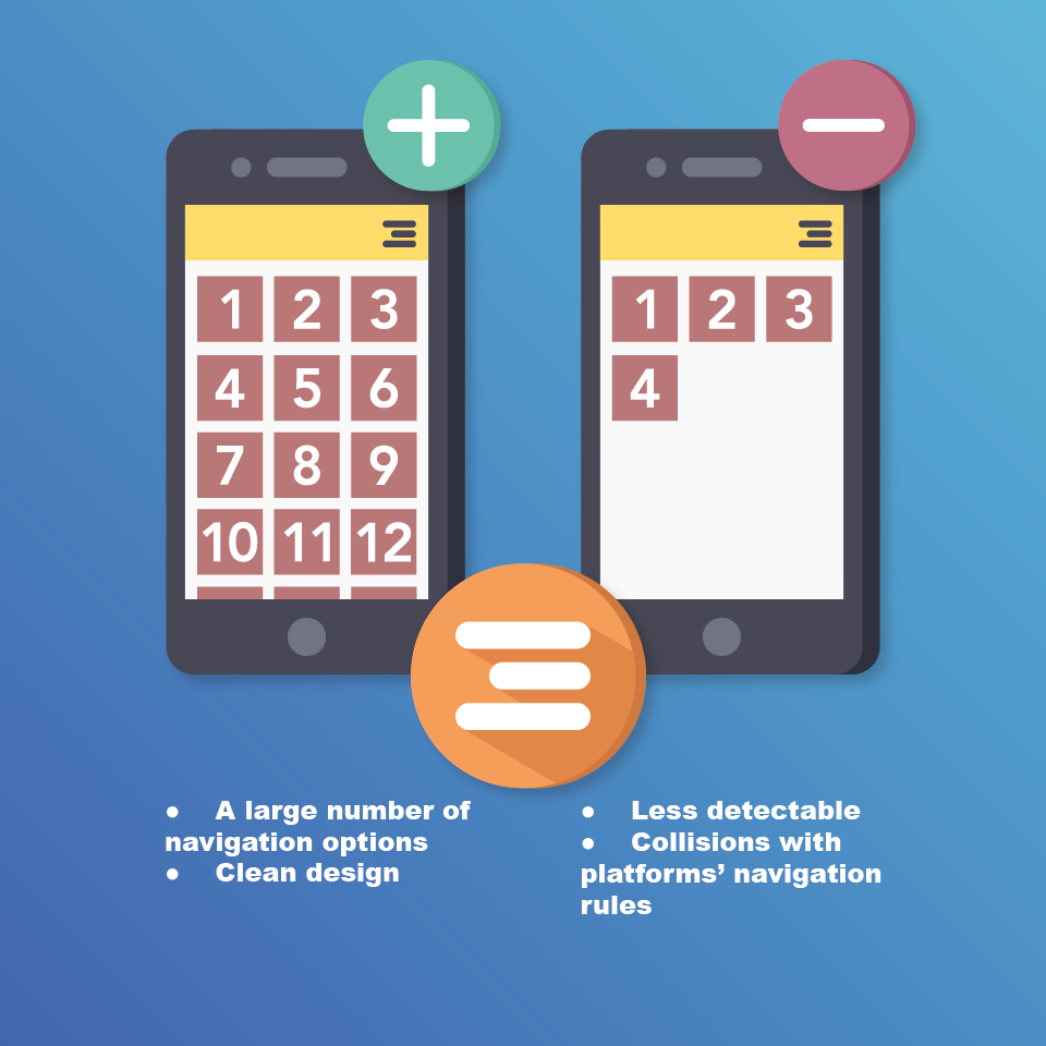
A place on a mobile screen, like any good piece of property, is very expensive. This navigation pattern, namely, these horizontal lines in the corner of the screen, allows you to optimally use “mobile real estate” and hide more complex navigation settings. It only opens after the user’s action, remaining hidden until then. As you can see, there is a risk that the user simply will not notice this menu, so the additional options that can make the user’s life easier will remain unexplored.
Due to its invisibility, this menu can complicate the use of your product, which is why it is categorically not worth hiding important calls to action or unique functions under it.
In other words, this is not ideal for the main menu, but it can successfully solve the problem of placing additional or secondary options. On the contrary, these less critical functions should be hidden behind the hamburger icon so as not to overload the user with a large number of options, effectively freeing up on-screen real estate and achieving a clean design.
Uber is a good example of this. The main function of the application is to search for a car, so secondary and related parameters like “Payment”, “Settings”, “History”, etc., are successfully hidden.
This type of navigation has already become standard for Android products, but for iOS, it can be a problem as it may conflict with the location of the main elements, which can lead to a reboot.
How and when to use the Hamburger menu
|
Appus Studio tips:
|
Using this navigation pattern is reasonable if your application has the following:
- More than five categories are at the highest level.
- Pages are saturated with content.
- The menu has several hierarchy levels.
Tab bar navigation pattern
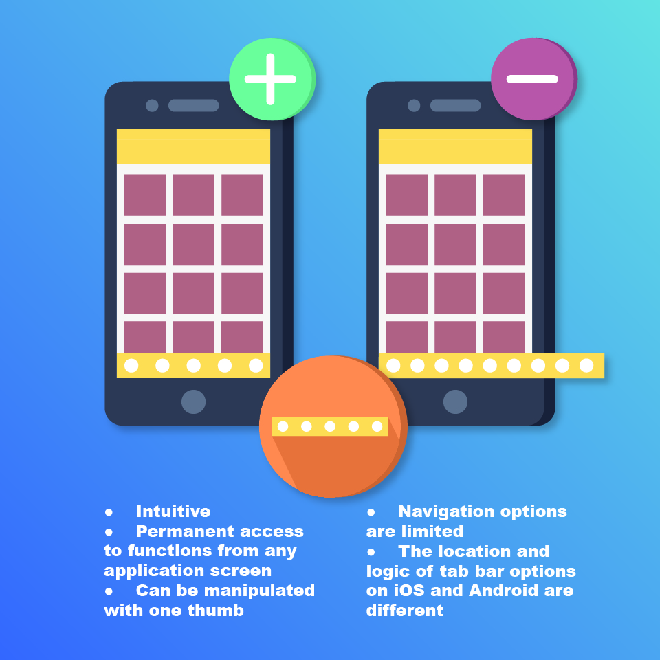
This pattern resembles a desktop. There are several destinations with the same value to users that are not hidden and provide direct access from anywhere in the application.
The right visual cues give the user instant information about his or her location within the app. The user has access to the basic options no matter which page he or she is viewing. This navigation pattern also allows the user to use the application when the device is held with one hand. If the tab bar is located at the bottom of the screen, the user can move around the application by tapping with his or her thumb.
However, this template will have a negative effect if the application has more than five options. Placing them and maintaining the optimal size of the sensory target will be difficult.
When using tabs, you need to consider the rules and recommendations for the user interface of different platforms. For example, on Android, tabs appear at the top of the screen, while on iOS they appear at the bottom.
How and when to use the Tab bar
|
Appus Studio tips:
|
Using this navigation pattern is reasonable if your application fits or could benefit from these qualities:
- The number of top-level navigation options is not more than five and not less than three.
- Categories are at the same hierarchy level (for the top panel).
- Quick switching takes place between related categories (for the top panel).
- There is quick access to unrelated categories (for the bottom panel).
- Categories are at the same hierarchy level (for the bottom panel).
Gesture-oriented navigation
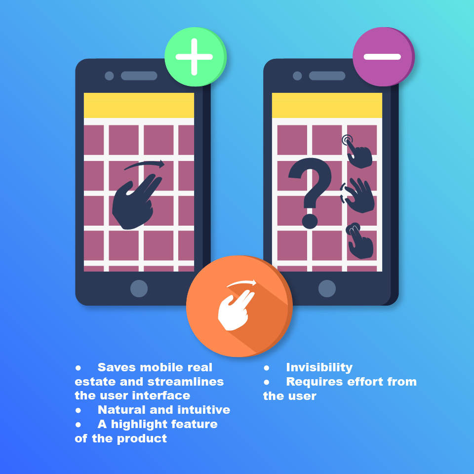
Such navigation allows you to quickly move through the application using certain actions, such as touching, dragging horizontally and vertically, zooming in and out, etc.
This navigation is natural, and the rules are clear for users of different nationalities and nations; for example, the Delete action intuitively makes the user want to drag an object off the screen. Also, this navigation can be a highlight of the product or its distinguishing feature, such as in the Tinder application.
However, the advantages of this navigation also pose a number of problems that will require constant attention. This navigation method can lead to problems with usability, where the user will either not understand how to use the product or will be confused when using different actions. This is because this navigation is invisible and requires additional effort on the part of the user, such as the need to remember which gesture to use to go to the desired function or the need to use unusual gestures.
These risks can be minimised by visual cues, consistency, and fluidity in action.
How and when to use Gesture-oriented navigation
|
Appus Studio tips:
|
This navigation is ideal in the following instances:
- Users want to easily and intuitively explore content.
- You need to prioritise a specific function.
- You need to get the attention of users.
Floating action button pattern
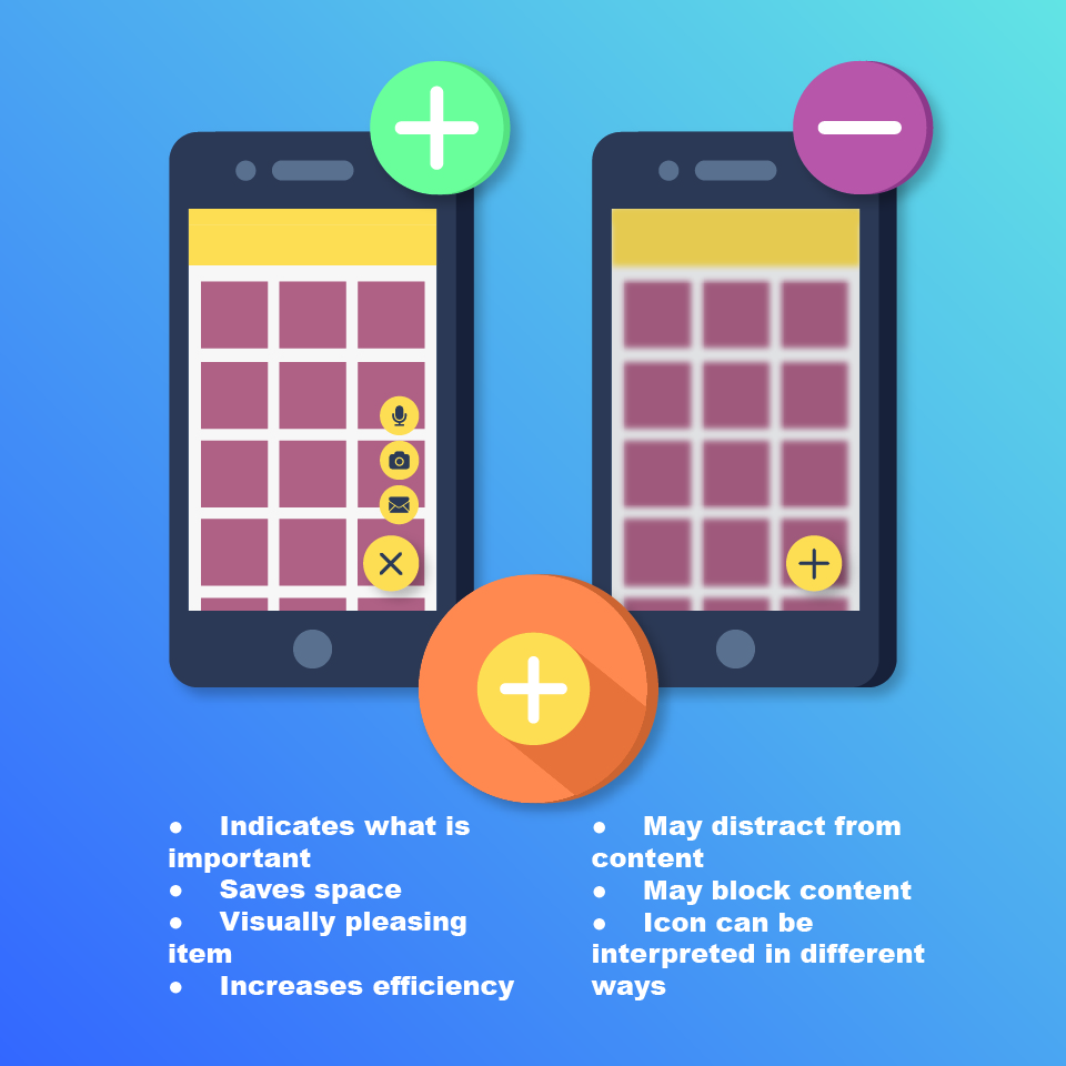
This is navigation in the form of a floating round button with an icon above the application interface, which can rise when highlighted and change colour when focusing.
This button saves space for more important content, looks visually pleasing, and improves efficiency as it clearly shows the user what their next actions are.
At the same time, visual appeal can distract from the main content and block some of its elements, so the user needs additional scrolling to see the element or information that is hidden behind the button. Another drawback is the lack of any text on the button. The same icon can be interpreted by the user differently, and the same icon means different actions in different applications.
When and how to use the Floating action button
|
Appus Studio tips:
|
This navigation style is used when it’s necessary to highlight an action, make it a priority, and emphasise that it is typical for your product; for example, the Play button in music applications is a natural signal for the user that guides them towards what to do next.
Fullscreen navigation
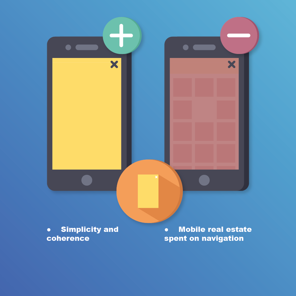
This navigation pattern uses the exact opposite principle in comparison to other templates. In this case, we’re not talking about minimising the space occupied by the navigation elements but instead using the entire space. As a rule, the home page is completely devoted to the navigation page.
This pattern helps organise information. The user is not overloaded with unnecessary information, so as soon as the user decides where to go, he or she gets to the screen that is entirely devoted to the completely desired content. At the same time, there is no other content on the home screen other than navigation.
How and when to use Fullscreen navigation
The use of this navigation pattern is justified if:
- The application is based on tasks and directions in which users strive to limit themselves to only one branch of the navigation hierarchy per session.
- Users need to focus on individual content rather than on overview screens.
Priority + navigation pattern
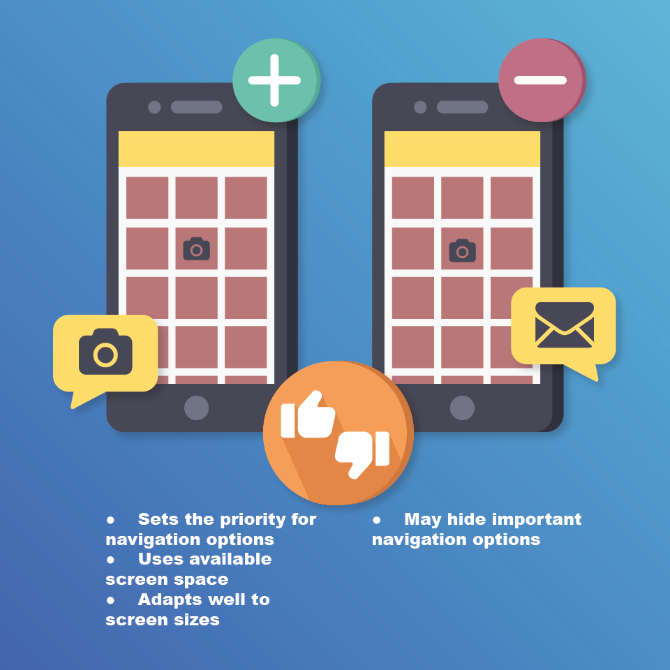
This navigation pattern allows you to show the user the most important or most frequently used navigation elements and hide the less important ones behind the Next button. Mobile real estate is used efficiently, and the menu itself is easily scaled to fit the screens of devices. At the same time, there is a risk of hiding some important elements since those elements that you select by priority may differ from those that users are seeking.
How and when to use Priority +
The use of this navigation template is justified if your application is voluminous and substantial, with a large number of sections and screens.
In conclusion
The evolution of devices, including changes in their sizes and dimensions, requires constant and flexible reactions from designers and developers. Classical models are transformed and supplemented, or vice versa, as well as simplified with one goal—to facilitate and accelerate interaction without a loss of functionality. For example, the 3D Touch navigation pattern allows users to interact with the application without launching it. Another interesting solution was found by the creators of the Ada application. They applied a mirror image of the hamburger menu and moved it down the screen to a more accessible place for the user.
Also, applications that use the one-handed principle in navigation have become increasingly common, especially for applications with call and messaging functions. This is a type of adaptation to the dynamic and social life of society.
The main priority of navigation is to help users. The easier it is to use the product, the more users you will have, meaning that you will receive an increase in the conversion of the mobile application.
Questions to ask to help build a successful navigation strategy:
- What are the goals of the user?
- What is the best way to achieve these goals?
- Can we afford it?
Let us know if you need the help of Appus specialists in creating mobile navigation that will be effective for your project.
 Services
 Work
Work
 Company
 Blog
Blog
 Contact
