By: Evgeniya Vi.
18 DEC 2019
2158
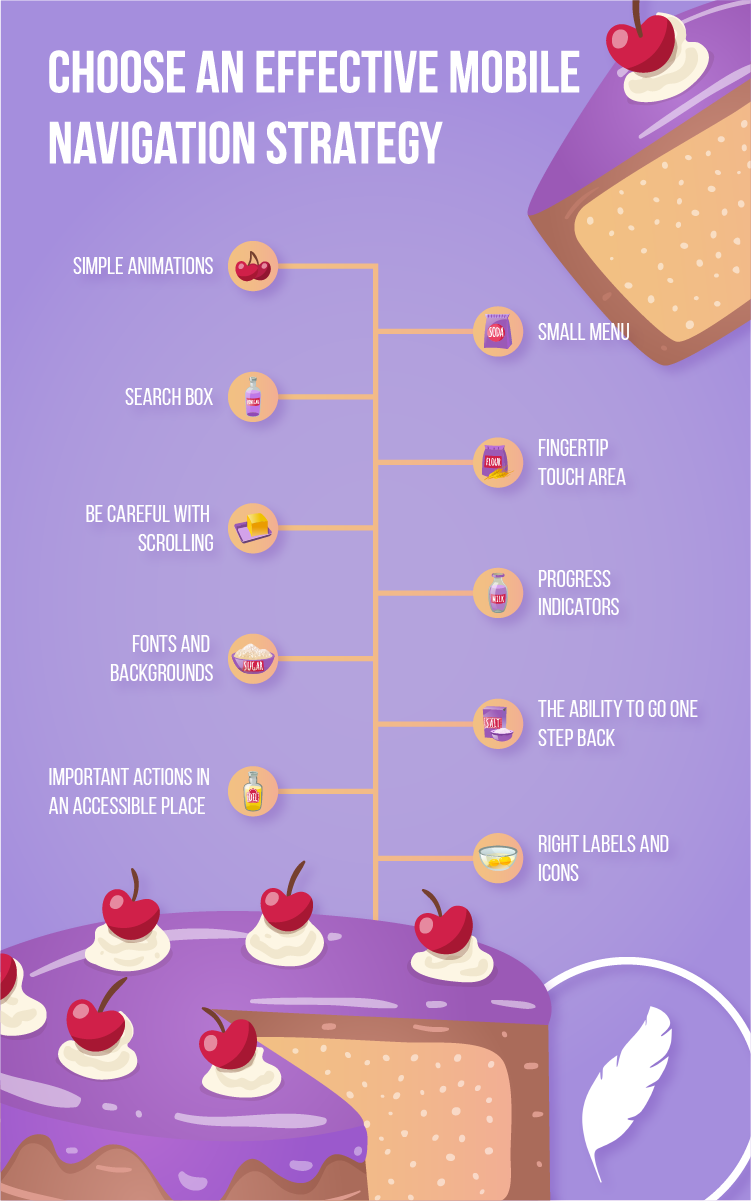
Recently, we wrote about how important it is to choose the optimal mobile navigation template as an effective mobile navigation strategy directly affects the conversion of the application—in other words, its popularity. I want to share Appus team's experience with you in developing UX and hope that this infographic helps you create a unique product with great UX.
So let’s take a closer look:
Right labels and icons
Menu labels should be short and meaningful; the text is placed on one line or replaced with a clear icon. Make sure the icon is clearly associated with the desired action; if it causes confusion, add text to the icon to exclude erroneous user actions.
Important actions in an accessible place
The most important and common actions should be on the most important pages. They should not only be in a conspicuous place but also easily accessible to the user. More often, it should be placed in a tab bar (a socket below). The main functionality of the app is placed there. At the top (navigation bar), secondary actions are usually placed but no more than three. Why? Because the main functions should be in the area for tapping with the thumb and should not create difficulties when the device is used with one hand.
The ability to go one step back
The Back button allows you to go back one step without losing any unsaved information but only if you take this into account during development and consider the feature to save the entered information for the correct back button functioning (save the entered data or not).
Fonts and backgrounds
The text should be easy to read, and letters should not merge and should be high enough. Highlight the most attractive information for the user, and show the hierarchy in colour and font size. It is recommended to use no more than two font colours on one screen, and do not get carried away with the font size and height. A wide variety of fonts will make the page unreadable and uninformative.
Progress indicators
Progress indicators display the correct length of the list of categories or subcategories and demonstrate the duration of the process. The user must understand where he or she is and when he or she will reach the final step.
Be careful with scrolling
Excessive scrolling makes for bad user experience. You will greatly facilitate the task for the user if you apply hiding/opening the top panel when scrolling down or up; turning boxes into hamburgers when scrolling; or showing status indicators in the folded menu, for example, notifications or unread messages.
Fingertip touch area
When choosing a menu size, consider the average size needed to touch with your fingertip. This size is at least 44 pixels from left to right and from top to bottom to click on an item.
A small menu
You can make subsections in the menu if the application is loaded with functionality. The menu itself should not be long so as not to annoy the user with the application.
Search box
Be sure to use the search function inside the application as there are browsing and searching users. The search box allows you not to lose the searching audience.
Simple animations
You can dilute the interface with simple animations as this will improve user interaction and make the application more aesthetically pleasing.
Make sure to comply with guidelines
In conclusion, it is worth saying that both Android and iOS platforms have their own rules for building an interface. These are platform guidelines. When choosing an effective mobile navigation strategy, I strongly recommend not departing from them in favour of creativity. First of all, the application should be user-friendly. Appus Studio UI/UX specialists are sure that within the given rules and tips, it’s still possible to show creativity, which will provide a stream of satisfied users and easier development.
Have a mobile app project in mind? Send us a note, and we’ll get in touch shortly!
 Services
 Work
Work
 Company
 Blog
Blog
 Contact


